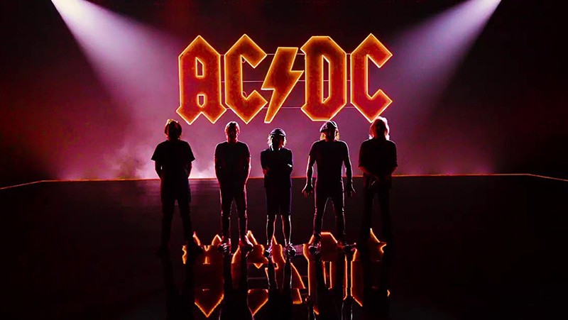
How the Bible Inspired AC/DC's Iconic Logo
Written by Marc Parker and Melissa Benefield Parker, Posted in Articles Designers
Image attributed to AC/DC and Columbia Records
A graduate of Art Center College of Design, California native Gerard Huerta is a designer of letter forms. He began his career at CBS Records in New York designing album covers, letter forms and logos for Ted Nugent, Blue Öyster Cult, Rick Derringer, Bob Dylan, the Isley Brothers, Harold Melvin and the Blue Notes, George Benson, Stephen Stills, the Charlie Daniels Band, among others.
After leaving CBS, Huerta designed lettering for AC/DC’s High Voltage and Let There Be Rock albums, the latter being adopted for the new iconic AC/DC lightning bolt logo. He also designed logos and covers for Foreigner, Firefall and the Outlaws.
In a 2012 interview with Smashing Interviews Magazine, Huerta was asked about the inspiration behind the AC/DC logo.
"I’m going to take you back to the record business and how I work with people. I worked with Bob Defrin on that. Usually you would do a series of sketches or drawings for them to choose from. It’s not where you just do one and they accept it. It usually requires a few sketches. In the case of AC/DC, it was a piece of lettering that was going on an album called Let There Be Rock. Back before that when I was at CBS, I did some lettering for an album cover for Blue Öyster Cult called On Your Feet or on Your Knees. It was a photograph of a limousine in front of a small church with an ominous sky. It was this big black Cadillac," Huerta explained.
"For some reason, I connected the idea of using Bible lettering for this logo, but rendering it with a bevel and in metallic. So I did this lettering for the Blue Öyster Cult album, which kind of became the look of heavy metal."
After diligent research, Huerta concluded that his metallic Blue Öyster Cult design style most likely originated at his drawing board.
"I’ve gone back before that to see if there was anything done like that and haven’t really seen anything. It became the defining heavy metal look," recounted Huerta.
"I had done this Guttenberg inspired lettering and when it became time to do the lettering for AC/DC, I used the Guttenberg with a twist. It’s orange, it’s got bevels and there are all straight lines. There are no curves. It’s very sharp. That just became the lettering for that album. In time, they picked that up as their look."
© 2022 Smashing Interviews Magazine. All rights reserved. This material may not be published, broadcast, rewritten or redistributed without the express written consent of the publisher.

