
Gerard Huerta Interview: The Man Behind the Logos
Written by Marc Parker and Melissa Benefield Parker, Posted in Interviews Designers
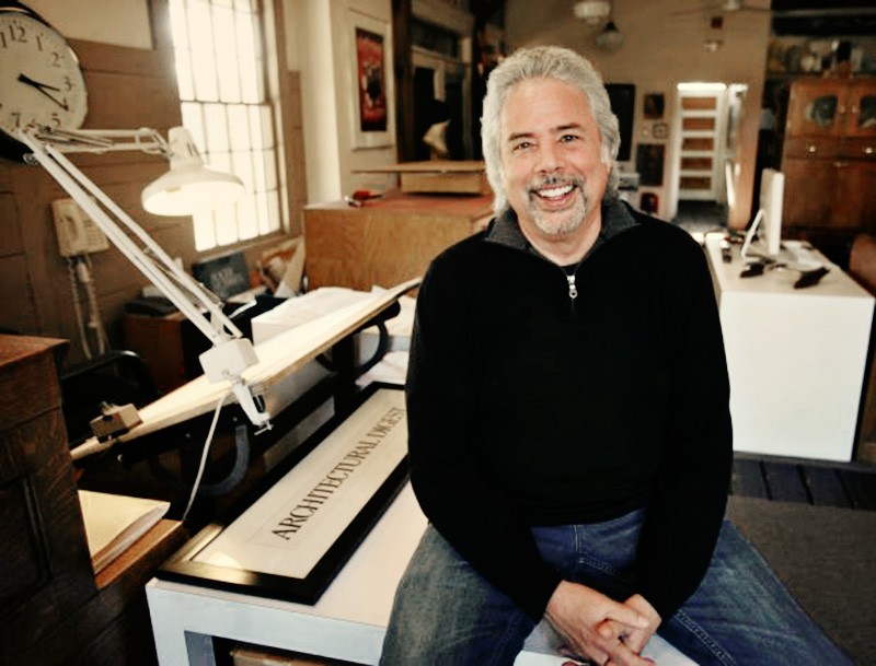
Image attributed to Brian A. Pounds
A graduate of Art Center College of Design, California native Gerard Huerta is a designer of letter forms. He began his career at CBS Records in New York designing album covers, letter forms and logos for Ted Nugent, Blue Öyster Cult, Rick Derringer, Bob Dylan, the Isley Brothers, Harold Melvin and the Blue Notes, George Benson, Stephen Stills, the Charlie Daniels Band and others.
After leaving CBS, Huerta designed lettering for AC/DC’s High Voltage and Let There Be Rock albums, the latter being adopted for the new iconic AC/DC lightning bolt logo. He also designed logos and covers for Foreigner, Firefall and the Outlaws, collaborated on the branding for Clint Eastwood’s Bronco Billy, Super Bowl XXVIII and designed logos for The Coal Miner’s Daughter, Friday the 13th-Part III and the one-sheet artwork for Atlantic City and Star Trek III: The Search for Spock.
"I had done this Guttenberg inspired lettering and when it became time to do the lettering for AC/DC, I used the Guttenberg with a twist. It’s orange, it’s got bevels, and there are all straight lines. There are no curves. It’s very sharp. That just became the lettering for that album. In time, they picked that up as their look."
Huerta expanded beyond the recording and film industry to design logos for Swiss Army Brands, MSG Network, HBO, Waldenbooks, Nabisco, Calvin Klein’s Eternity, Pepsi, Time, People, The Atlantic Monthly, Working Mother and Architectural Digest among others.
Smashing Interviews Magazine: Gerard, when did your interest in drawing and design begin?
Gerard Huerta: That goes back to being a child. I was a big fan of the Jon Gnagy show, Learn to Draw. It was a black and white show, and Jon would give you drawing exercises. I had a little drawing kit that my parents bought me. That got me started. I also had a wonderful aunt who lived with my grandparents, and in her bedroom, she had all these paintings she had done. She was an oil painter, and I convinced my father to get me some oil paints.
I was just one of those people that liked to draw all the time. By the time I got to college, I was an art major at the University of California, Irvine, and was just searching around trying to find what I wanted to do. I ran into an Art Center College of Design catalog. That sort of cinched it for me because I found a lot of work in there that was spectacular. I enrolled and did a four-year program in about two years and eight months.
Smashing Interviews Magazine: Was your first job out of college with CBS Records?
Gerard Huerta: Yes. After I graduated, I got married. My wife, Debra and I moved to New York. That was in 1974 and not a good time to be looking for a job in New York. The city was going broke. It was just one of those kind of similar times as today for the city. Actually, the city is booming much more now than it was then (laughs).
I went around and saw a lot of people, dropped off portfolios, and after about two months of pounding the pavement, I decided I was going to go freelance. I had a card printed up and distributed it to the people I had seen that day. I got two job offers, and one happened to be CBS to design album covers.
Smashing Interviews Magazine: That must have been exciting. Did you have any interaction with the recording artists?
Gerard Huerta: Almost never (laughs). I worked as an album cover designer and worked for creative directors, specifically John Berg and Ed Lee. They would handle most of the clients’ situations, if you can imagine the rock or the classical artist being the client. I really had a desk job where I would draw up logos and design album covers. I was in charge of the production of them. But, mainly for me, because I was particularly interested in lettering, I designed a lot of logos and lettering for the albums. I sort of almost bumped noses with Paul McCartney, and I did get to meet Kenny Loggins and a few other people, but generally I was not in that part of the discussion.
Smashing Interviews Magazine: Do you often work with a partner?
Gerard Huerta: There have been collaborations. I had a long running association with Roger Huyssen who is an illustrator. We shared an office for about twenty-five years as freelancers. We did some movie work together where I was involved in the lettering or logo aspects of it, and Roger was involved in the illustration part. We did the theme art for a Super Bowl poster together. The collaborations were not often, but they were fun.
Smashing Interviews Magazine: What is involved from start to finish in designing a logo?
Gerard Huerta: Each one is a different kind of situation. For example, Architectural Digest had a logo sometime in the 90s when I reworked it. I was called by a design studio to rework the lettering. They were not happy with the look. It was a hand drawn logo. My job was to draw it up, and at that time, ink the final one because we weren’t using computers. It’s about a twenty four-inch piece of lettering.
That probably took three weeks to go through the process, but then I recall when I worked with Time magazine. I’d do a cover, for example, on Islam or The Who. They’d call me up on a Friday morning at 11:00 and say, “We need some lettering for the cover.” I would do it, and at 5:00 that same day, the messenger would pick it up and drive it into the city. That was about a six-hour job, so, it varies. It’s kind of all over the place depending on what the client needs and what I can produce for them.
Smashing Interviews Magazine: I imagine they give you much input on how they want the product conveyed.
Gerard Huerta: Well, certainly. Very few of my clients are what I would call direct clients where I’m dealing with a corporate person. Because I’m a specialist, most of the time I’m dealing with a creative director or a designer, someone who understands my specialty and what I can bring to the table. Then, I’ll work for that knowledgeable person. That has generally been the case during my career where I would work with other creative people. That actually makes my job easier because you’re sort of on the same plane in terms of understanding and education and the way things look.
Smashing Interviews Magazine: What was your inspiration for the AC/DC album logo?
Gerard Huerta: I’m going to take you back to the record business and how I work with people. I worked with Bob Defrin on that. Usually you would do a series of sketches or drawings for them to choose from. It’s not where you just do one and they accept it. It usually requires a few sketches. In the case of AC/DC, it was a piece of lettering that was going on an album called Let There Be Rock. Back before that when I was at CBS, I did some lettering for an album cover for Blue Öyster Cult called On Your Feet or on Your Knees. It was a photograph of a limousine in front of a small church with an ominous sky. It was this big black Cadillac. For some reason, I connected the idea of using Bible lettering for this logo, but rendering it with a bevel and in metallic. So I did this lettering for the Blue Öyster Cult album, which kind of became the look of heavy metal.
I’ve gone back before that to see if there was anything done like that and haven’t really seen anything. It became the defining heavy metal look. I had done this Guttenberg inspired lettering and when it became time to do the lettering for AC/DC, I used the Guttenberg with a twist. It’s orange, it’s got bevels and there are all straight lines. There are no curves. It’s very sharp. That just became the lettering for that album. In time, they picked that up as their look.
Smashing Interviews Magazine: For Foreigner and Boston, did you design the letterings for particular albums?
Gerard Huerta: Yes. Well, I believe the Foreigner one was their very first album. Bob Defrin was the art director. I was asked to do some lettering for that album. Boston was collaboration with Roger Huyssen again. We did that job with a famous designer, Paula Scher. Paula hired Roger and myself to work on that cover. My job was to design the lettering to go around the guitar spaceship, and Roger did the rendering on it.
Smashing Interviews Magazine: Was the Chicago logo design a fingerprint?
Gerard Huerta: That’s an interesting one. I didn’t actually design the lettering. The lettering had been designed by Nick Fasciano a few years before. John Berg who was the creative director came up with all these great ways of envisioning the word, “Chicago.” If you recall some of the albums, there was a chocolate bar.
The word, “Chicago” always remained the same size on the album cover. It was just a different interpretation. John called me to paint the Chicago logo and create a thumbprint design. We had a person at CBS in the mechanical department named Jim who did great thumbs, so we had him do a bunch of thumbprints and used them for a reference to design into an actual thumbprint.
Smashing Interviews Magazine: I’ll bet it’s a weird feeling to walk into a grocery store and see your logo on a Nabisco product.
Gerard Huerta: That is probably the most reproduced thing that I’ve ever worked on. That was a redesign with Bernhardt Fudyma. That logo has been changed maybe six or seven times over their history. It was originally a printer’s mark. In the version I ended up drawing for them, they were looking for sort of a softer look. Hence, the rounding of the triangle and sort of rounded letters. If you look at a Nabisco package, the logo is generally on every panel so there are six on a package. Just multiply that by how many products they sell daily, and you can imagine how many impressions that must be.
Smashing Interviews Magazine: The lettering is inside of a circle, and the design that looks like an antenna is a printer’s mark?
Gerard Huerta: It was a printer’s mark, and it just happened to be a design a printer used, and then, I think they had one version of it with that, and it said NBCO for National Biscuit Company. It was Nabisco later as it went through time. It was initially a printer’s mark and then, it just went through evolution of the brand. I’ve worked on many logos that have been redesigned logos. You don’t want to throw a logo away because in throwing one away and redesigning completely, you’re throwing away a lot of history, throwing away a lot of what people remember as imagery.
I think it’s always important if you have a good company, have a good logo, something you can update, but you really don’t want to throw it out completely. The Gap recently made a very big change. It was just too abrupt and too different. I think you throw a lot of brand equity away when you do that.
Smashing Interviews Magazine: You designed the Pepsi Light font. Tell me about that process.
Gerard Huerta: First off, I’m not a big font designer. I know a lot of font designers. They have a different view of artwork. But, I was hired by Pepsi to take the four letters they had and flesh them out into an entire lower case font for their use. I’ve designed an entire font for Waldenbooks and for Time magazine. We did a whole series of Franklin gothic inspired type faces with outlines and dimensions so they could put it over photographs, and you could still read it.
I also did a series for People magazine which were a bunch of fonts. It is a different kind of discipline. I don’t enjoy it as much as doing a specific piece of art. When you design a font, you have to design a letter to be its lowest common denominator because it has to work with every other letter. When you do a logo, each of those letters are in a fixed position and can really kind of be the best they need to be. I like that attribute more than I like the dumbing down of a letter to work with everything else.
Smashing Interviews Magazine: Are you still working with Swiss Army?
Gerard Huerta: I worked with them from the very first watch they did. It was a fellow I knew in the record business, Myron Polenberg. Myron was doing packaging for Swiss Army, and they had a meeting and decided they needed to do a watch. Myron stepped in and said, “Why don’t you let me design it?” He came up with the look of the red ring and black watch and the webbing and hired me to draw the numbers and hands.
The watch became very successful, so I still have an association with Swiss Army drawing dials. I have seventy or eighty here in my drawer that I’ve done for them. Maybe thirty percent of them were used, but they’ve all been hand drawn. They’re not typefaces. They’re actually invented numbers to work visually.
Smashing Interviews Magazine: Do you have a favorite logo that you’ve designed?
Gerard Huerta: I’m hoping to do that soon (laughs). Actually, on the side, I’ve been working on a series of renderings of vintage guitars. I’m also a guitar enthusiast. I played for years in bands and still do. I’ve got a little bit of a collection of guitars. I started becoming interested in very specific guitars because there was a period from 1951 to 1961, which I consider to be the golden decade of electric guitar design. It’s where the precision bass, the Stratocaster, the Les Paul, the Les Paul 56 and the jazz bass came out of a ten year period, and they’re still pretty much the same guitars as everyone uses today many years later.
There are very specific features about those vintage instruments that I try to capture in doing them in art and doing them as if they were brand new today. That has been a little side project. I’ve done about eighteen or twenty of them. I have them printed actual size so in the frame they look like a guitar hanging on the wall. That’s like another side of doing artwork, I guess. I’m in association with the National Guitar Museum, and they actually have about six or eight hanging in that traveling show right now as full size renderings representing that decade of the electric guitar when all those wonderful designs were created.
Smashing Interviews Magazine: I’m curious, Gerard. If I said the words, “Smashing Interviews Magazine,” to you, does a logo immediately come to mind?
Gerard Huerta: Well, are we talking about something on the web, something small, something bigger? I go into the whole process of how you use it, how it’s going to be used, etc. It’s all the typical things that a designer like myself has to ask. I certainly get images. When you say, “Smashing Interviews,” I certainly get a kind of image about what those letters might look like. Then, for me, it’s sitting down at a drawing board to start sketching.
That’s another thing. I’m from the old school in that I still have a full drawing board set up, and when I get a job, I sit down with pencil and paper or marker, and it’s still sketch and draw. Although something may be very rough that I can scan, usually by the time I scan it, in my mind, it’s ninety percent there. All the rest of the time spent is really execution to get everything right.
I’m not a person that can go right to the computer and start drawing. I know there’s a generation out there now who actually does that. I don’t know how they do it, but they actually go straight to the computer. I also believe that’s how you get the unique solutions … by drawing. I think many designers start with typeface, but once you decide on a typeface, you’ve kind of eliminated so many other solutions it can possibly be. With drawing, you have a little more space to create and invent letter forms and things.
Smashing Interviews Magazine: Do you ever get stumped on a project?
Gerard Huerta: All the time. I think if you look at solutions, there are a lot of solutions. There are a few good solutions and they’re very few great solutions. That’s just typical of any kind of project. For example, you can get a word you have to work with. Let’s use the word “TYPE,” and put it all in capital letters. It’s a horrible word. It’s all top heavy except for the “E.”
You have this horrible thing to begin with that’s probably not going to give you the great solution. You might get a good solution or you might just get a solution. But, yeah, you get stumped a lot. Many times you’re just trying to make something that doesn’t look good … look good. Many times, that is just the job.
© 2012 Smashing Interviews Magazine. All rights reserved. This material may not be published, broadcast, rewritten or redistributed without the express written consent of the publisher.